Client
Schneiders
Services
Brand identity & website
Collaboration
Mike Ihnat
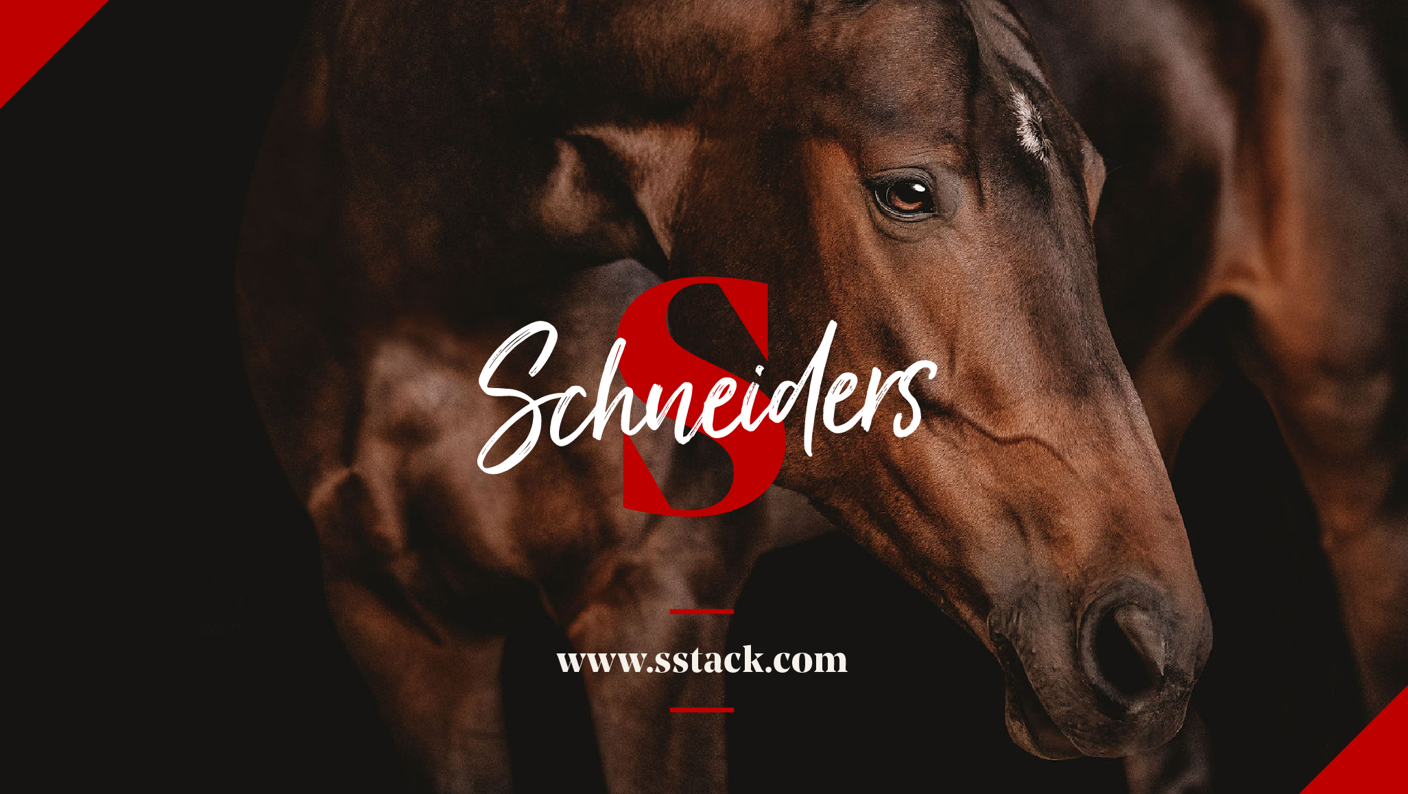
Since 1948, Schneiders had grown to become the destination for all equestrian shoppers, but their brand hadn’t grown with them. Most importantly, it wasn’t conveying who they were to their customers. Also, they truly sold everything for every equestrian, making it difficult to define the brand.
With Schneiders we wanted to be able to communicate two messages with our brand: The trust that comes from years of experience, and the unmatched relationship established with the customer. Using a modernised version of a heritage font, we established Schneiders as having both the reputation it’s built up over the years, all the while being relevant to shoppers today.


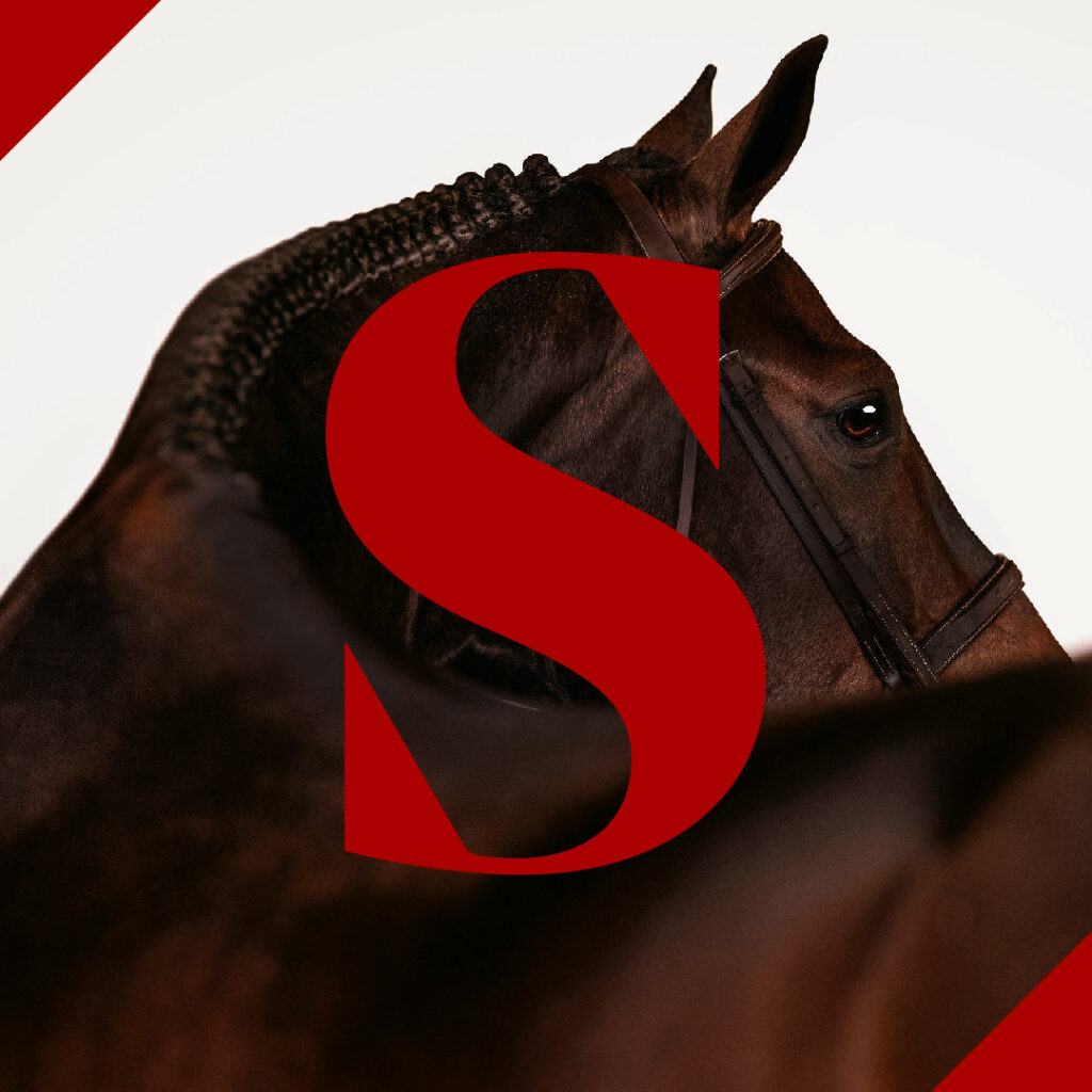
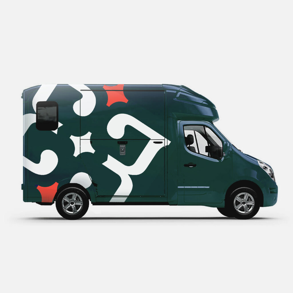
We made the Schneiders’ brand instantly recognisable with strong contrasting colours, a bold ‘S’ and a script font, allowing it to be as flexible as it is striking.
Animated Video
Measuring your horse for a blanket is a challenge. As a part of the new brand we created new animated videos to help equestrians with difficult tasks.


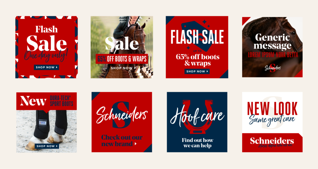
The Schneiders social media pages are where customers first learn about offers and sales. We created eye-catching social media design that drove clicks and views.